What’s the point of display? By John Dabell
Why do we bother with classroom displays?
Some classrooms don’t really need their walls because they don’t actually do much. Okay, they might hold the school together and provide teachers with their own little habitat to teach in but why have walls if you don’t use them?
When you walk into some classrooms they scream at you. Apart from a few posters and a timetable, these are just spartan resting places for drawing pins to rust to death. They show little effort, are devoid of personality and are hardly inspiring.
Displays are important to any school but they are often abused or abandoned.
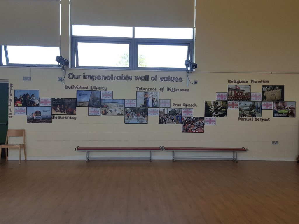
They are powerful points of reference in class and can make a huge difference to drab and dreary corridors.
Some teachers invest a huge amount of energy in their classroom displays but this can often be detrimental to learning. Some classrooms are drenched in displays and become so cluttered they bring about claustrophobia and get in the way. Too much display is harmful.
Getting the balance between being overwhelming and underwhelming is clearly important. Decluttering is one thing but sterilising a learning environment of displays, artwork and resources can be detrimental too. Heaven forbid that your displays include ‘data walls‘.
On Display
Dave Burgess (2012) in Teach Like A Pirate reckons that one of our secret weapons as teachers is being able to control the physical space. He suggests we use ‘interior design hooks’ to transform our classrooms to create the ultimate atmosphere for a lesson. He describes having special days where he creates a blank canvas by covering every wall in plastic sheeting and then adding decorations on top to a particular theme.
Some might argue that even when changed regularly, classroom displays have little educational value and pupils see them as just wallpaper or window dressing. I disagree that they are just mere decoration and it is nonsense they are there for the teacher to look and feel good about themselves. Displays can support the improvement of pupils’ learning, they create a mood and they can be shocking. Learning needs to shock sometimes to be memorable.
Hywel Roberts (2012) in Oops! Helping children learn accidentally says that “Display is to the teacher what the saw is to a carpenter: essential.”
There are lots of things to remember about display and he points to ten top hints. He says that display:
- should carry meaning to those who look at it
- isn’t the job of the teaching assistant
- is a reflection on you as a teacher
- needs to be managed in the same way you’d manage a flower arrangement
- can be personalised using photos of pupils
- can be used to celebrate success
- can be put anywhere
- should stimulate enquiry and be challenging
- should show processes as well as final and best pieces of work, but shouldn’t be dated
- is often ignored
Research tells us that Clever Classrooms are those where wall displays are lively without being chaotic and “As a rule of thumb 20-50% of the available wall space should be kept clear.”
It’s tempting to use every available bit of space on a wall and spread educational nuggets all over then like magic margarine. But that doesn’t work. Children need space to think and that mind space can’t breathe if the walls feel l

ike they are closing in.
A Display of Affection
Classrooms are the core learning spaces in a school and so they need to be exciting and dynamic. They also need to be ‘owned’ by the class so that children see their own work on the walls. If a classroom is largely the work of a teacher and decorated with commercial resources and ‘inspirational quotes’, it feels soulless and corporate.
Displays make an impression and so careful thought has to be given to what messages they are giving out. The main message from a pupil perspective is “Does my teacher value me and my work?”
Children like to see their own stuff and can feel proud as punch if it gets displayed. If something doesn’t make the grade then this can have a negative impact on children’s thinking and self-esteem. Always displaying the ‘best’ work is a no-no because this excludes children. Every child needs their moment of glory and a class with an inclusive and growth mindset will recognise not everyone can be the same but everyone needs to be included.
Tait Coles (2014) in Never Mind The Inspectors: Here’s Punk Learning says we should display everything and we shouldn’t be “frightened of displaying students’ work that is wrong. Students can learn so much from misconceptions and so can teachers.”
For true ownership, we need to think about who is responsible for the displays. As Jim Smith (2017) suggests in The Really Lazy Teacher’s Handbook we also need to get “students to design and put up the displays.”
Why not take this one step further as illustrated by Tim Brighouse and David Woods (2013) in The A-Z Of School Improvement and get older pupils as ‘display for learning advisers’ (DLAs) as “volunteers to do something to improve all aspects of display in the school”.
What to Include?
Displays don’t have to drive us up the wall.
Planning what to include on your wall space needs a Clever Classrooms mindset so that children aren’t distracted yet at the same time challenged and engaged. This means managing the visual environment systematically and keeping displays alive and well on a rolling basis. Some ideas include:
- a Working Wall to support children in their current learning and enable them to become more independent
- an Anchor Chart display to frame discussions and prompt learning conversations
- a Feelings Board so children can populate it with their thoughts during lessons (Coles, 2014)
- a ‘Heavy Duty Learning Wall’ where children write on a sticky note what they’ve learnt after each lesson (Coles, 2014)
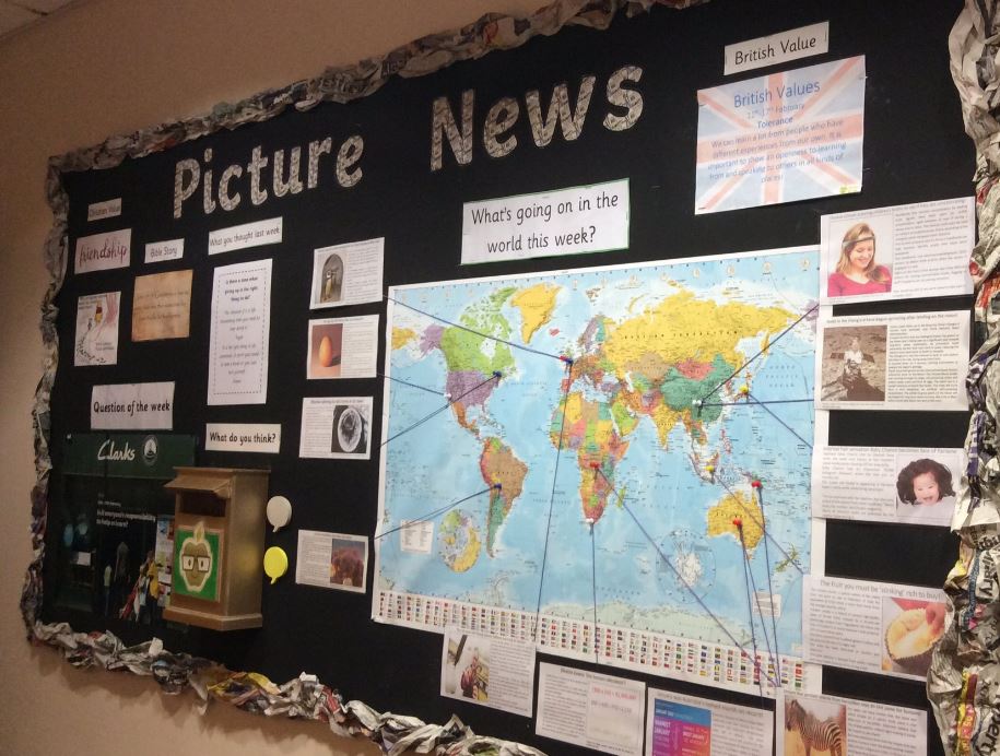
- a News Board displaying local, national and international news. Picture News is ideal!
- a Celebration Board to display the achievements of children inside and outside of school
- a Wonder Board that poses a question of the week or questions that children have they’d like answered
- a Mugshot Board showing the photos of everyone in class using a Top Trumps style format
- an Open Me Board showing pieces of work with covered-up information that can be opened
- a Feedback Gallery to enable children to give and receive feedback on several pieces of work at the same time (Griffth and Burns, 2014)
- an Interactive QR Board that link to video projects that students have created
- an Inspirational Quotes board to fire motivation and fuel growth mindset
- a Mistake of the Week board (Claxton and Carlzon, 2019) or an Alternative Conceptions of the Week board using Concept Cartoons.
- turning windows into Word Walls using window crayons for brainstorming ideas
- a Puzzle Board containing a variety of problems, mind-benders, conundrums, riddles, challenges and brain teasers
- a Personal Best board showing examples of children’s best work so far
Displays need to be informative, interactive, accessible and creative so that pupils are inspired.
But being sensitive to the needs of particular pupils is crucial. Visually rich and dense displays can have a negative effect for children with Autism Spectrum Disorder. Displays also need to be colour-blind friendly so that children who are colour-deficient are not hindered in their learning.
Displays seem to be something of an after-thought in some schools and as for training, well it is non-existent. When did your school last use part of an Inset day to debate Clever Classrooms and the visual environment and its impact across the school? If displays are the bane of your life, then clearly there is a training need.
A Fine Mess
No one expects every teacher to be a master in the fine art of classroom feng shui but teachers should know the difference between a Pinterest classroom and a classroom with soul as an active museum of learning or think tank.
Displays don’t have to be perfect because as every teacher knows, learning is messy so displays need to reflect the business and busy-ness of learning including learning pits, learning ladders and riskometers.
Displays do have their place in schools and when managed intelligently, they make classrooms a place where pupils feel safe, welcome, and stimulated, and where highly focused learning takes place. Try Picture News for when of your displays and get children immersed in the world around them.
